Shakespeare kent me beter dan mijn lief
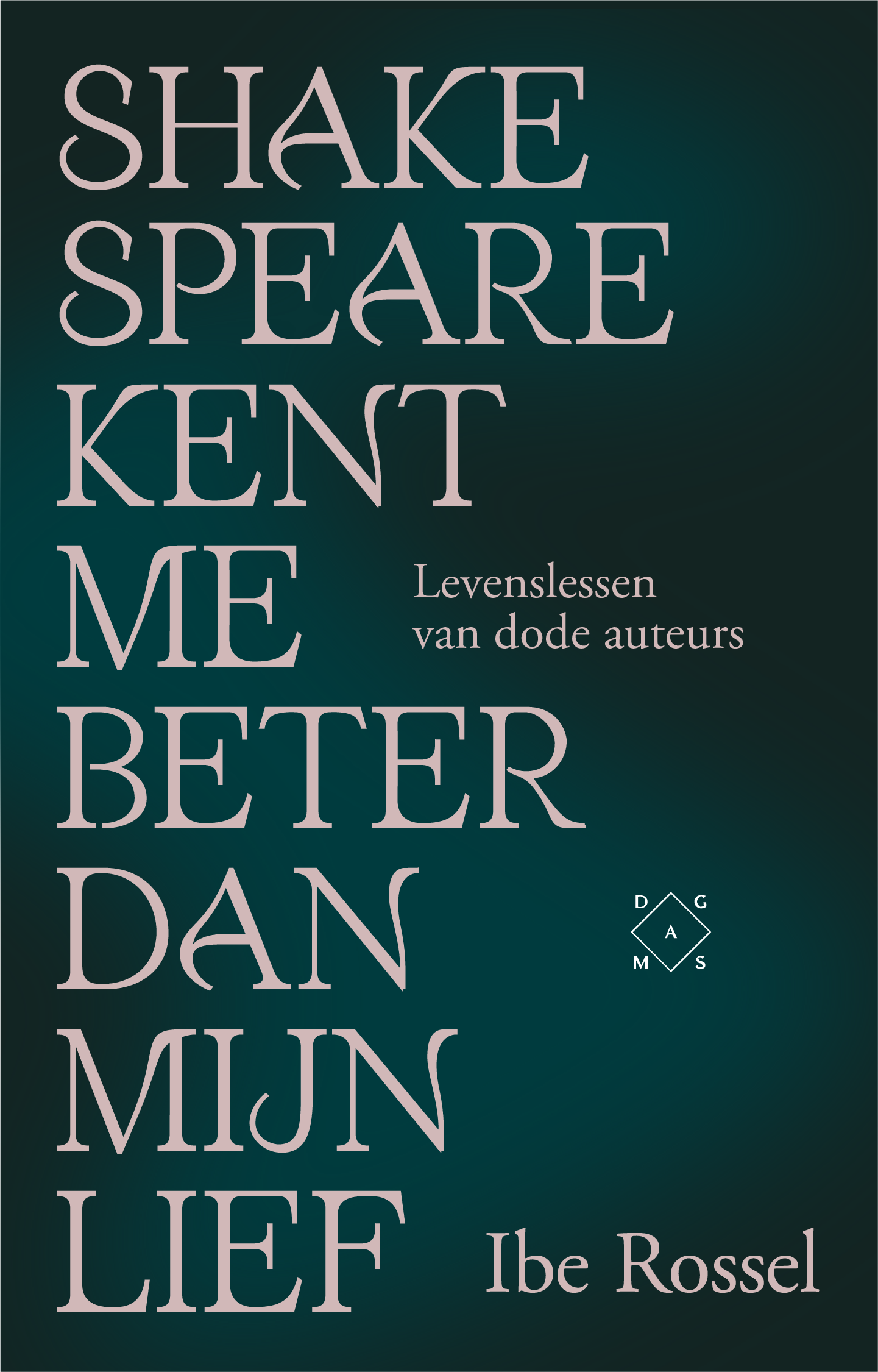
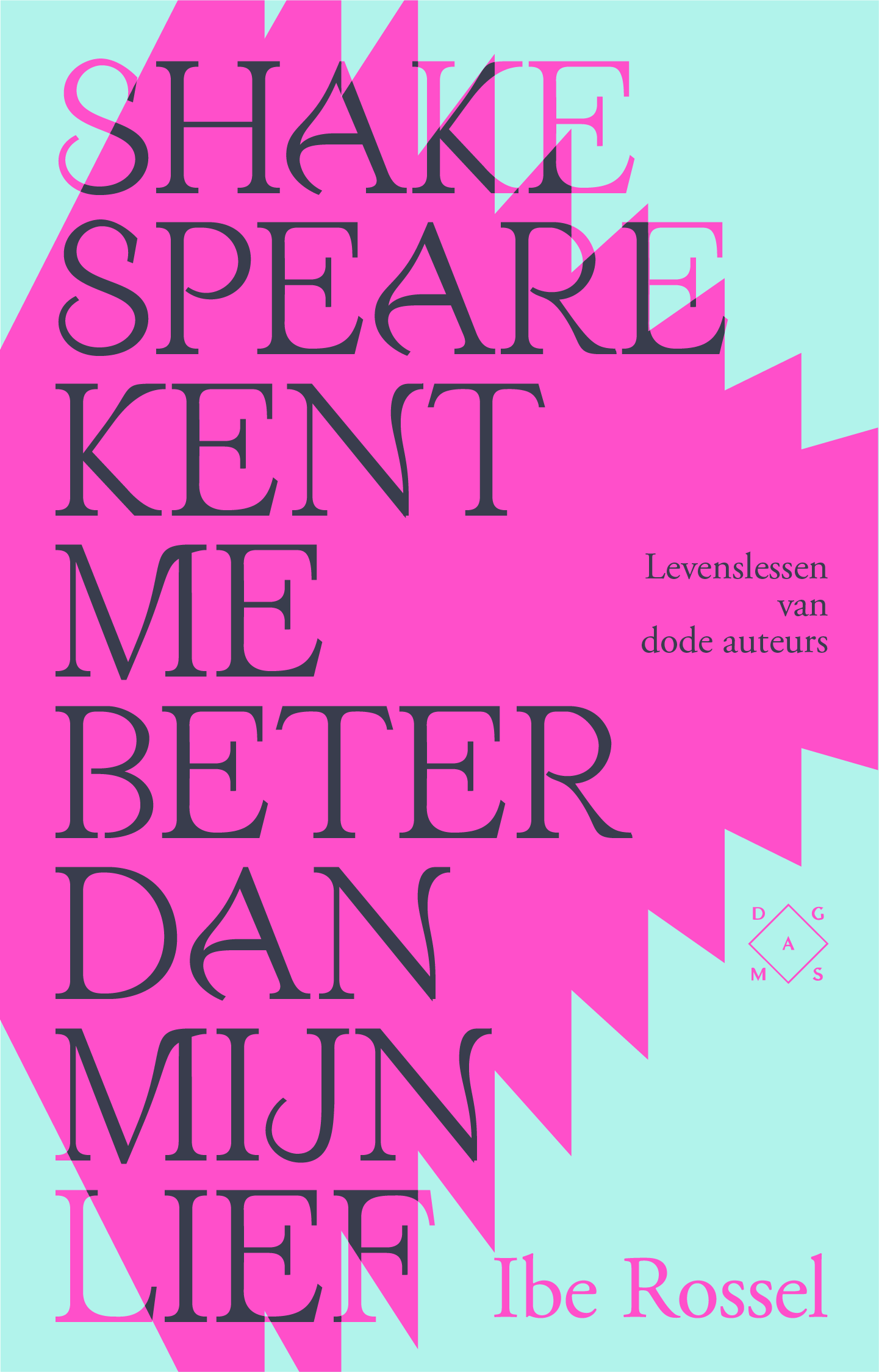
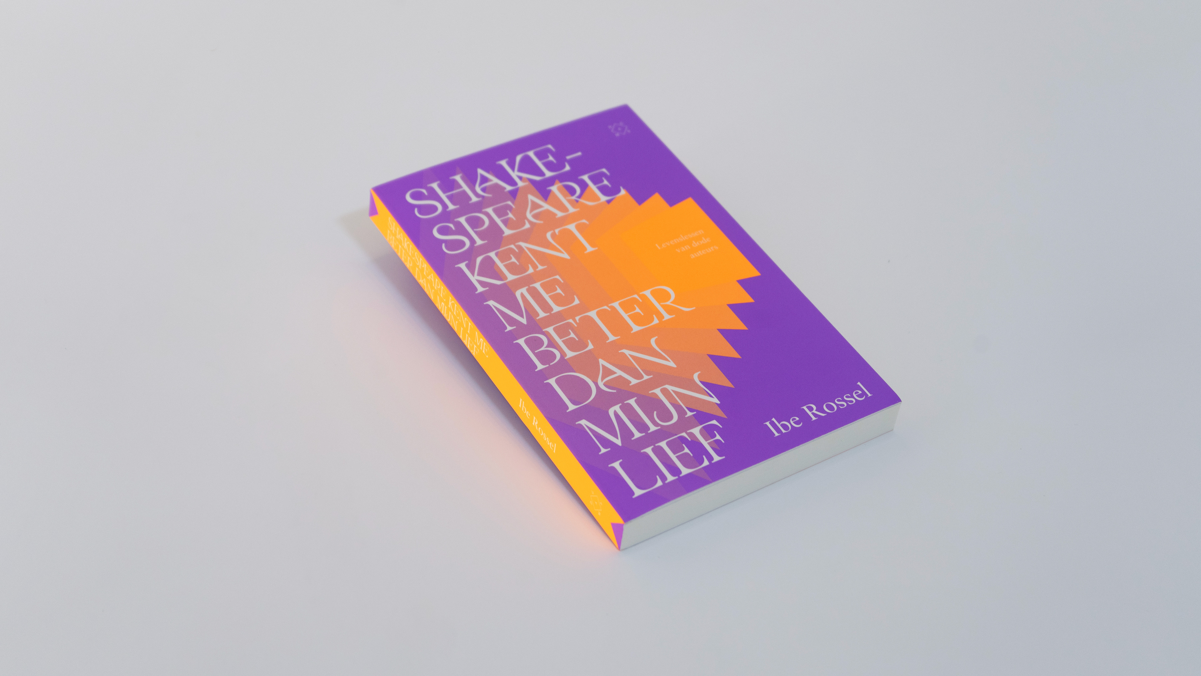
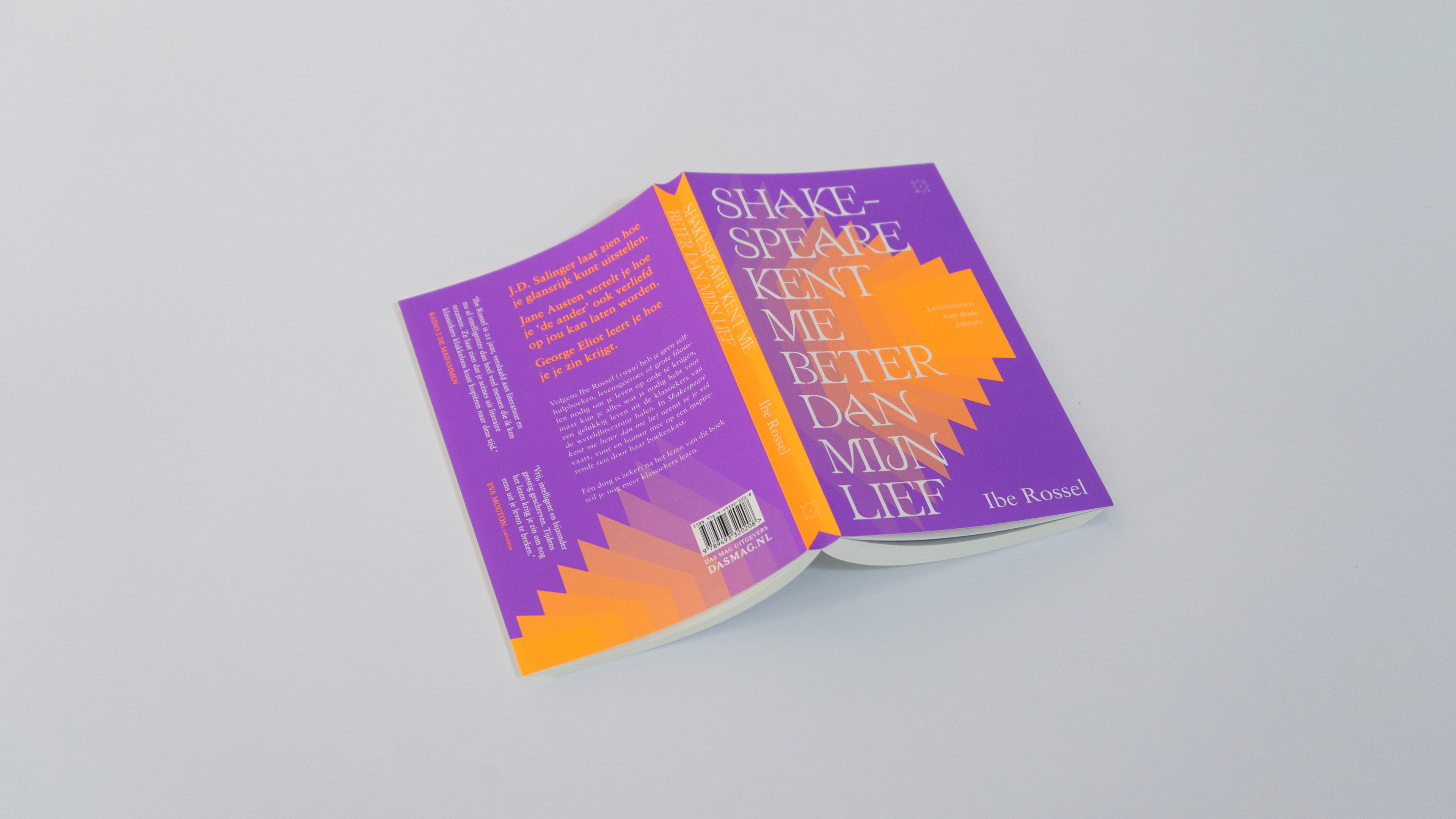
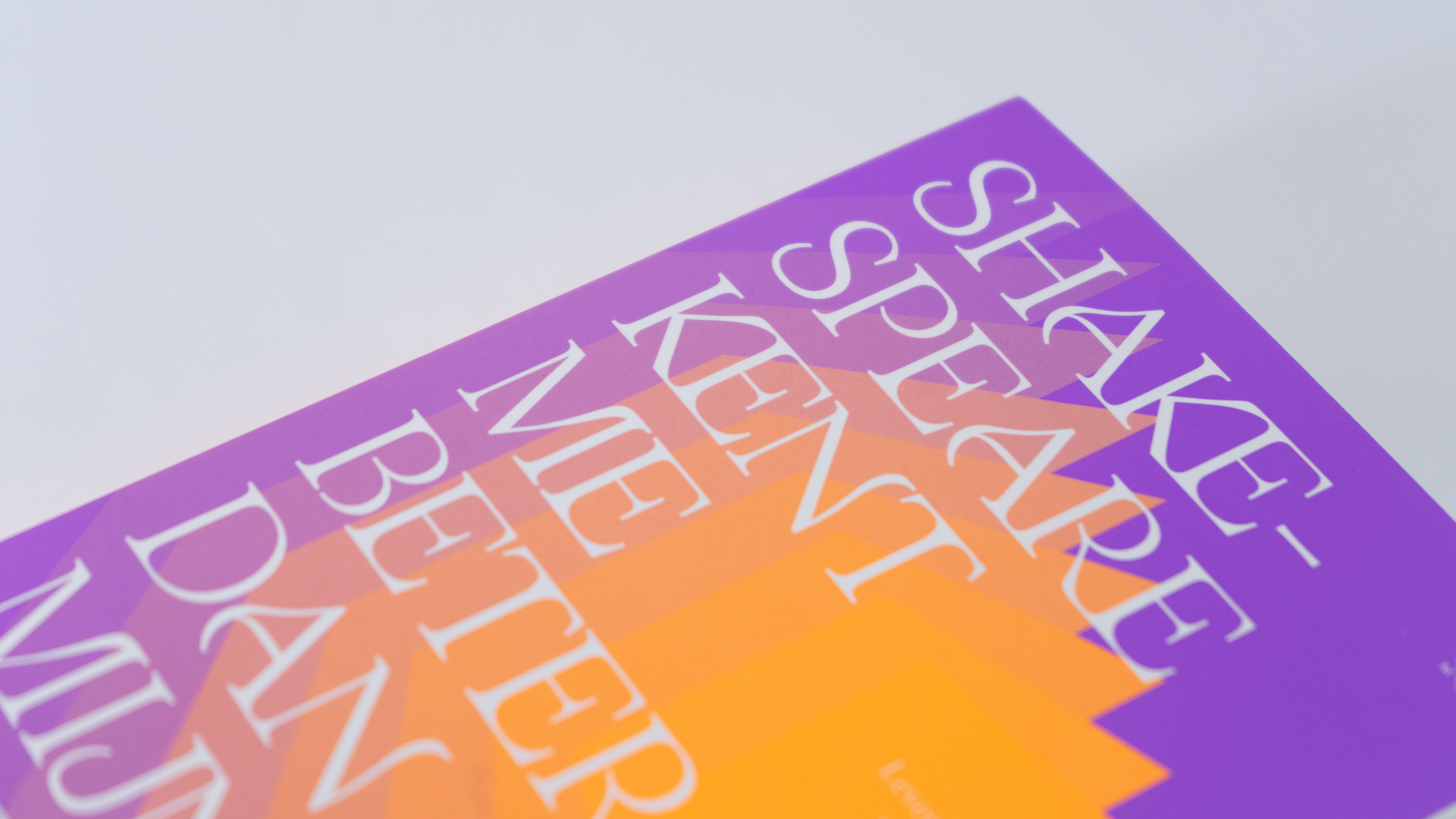
Book cover design for Ibe Rossel's "Shakespeare kent me beter dan mijn lief", Published by the renowned Dutch DAS MAG. The front cover, spine and chapter titles are set in a revised version of Testue, a self-designed typeface.
Ibe Rossel's essay-style novel deals with life-lessons taken from classical literature such as Jack Kerouac, Jane Austen and - off course - William Shakespeare. After selling 5000 copies in Flanders, Belgium, the book was revised and re-published with an added chapter and a brand new cover design.
The publishing company and it's art direction team wanted to go for a bright, appealing cover that would stand out on display in a bookshop - or in your bookshelf at home. The typeface was one of the first design choices made. Then came the challenge of designing background elements in a complementary way that don't clash with the decorative typeface. The shapes resemble the act of flipping through pages, referring to the multitude of works that Ibe Rossel read through to put together her book. Below is an overview of prototypes and rejected versions that give some further insight in the design process.

ISBN: 9789493320208
RELEASE DATE: JUNE 30TH, 2023
PAGE COUNT: 184
AUTHOR: IBE ROSSEL
PUBLISHED BY: DAS MAG
RELEASE DATE: JUNE 30TH, 2023
PAGE COUNT: 184
AUTHOR: IBE ROSSEL
PUBLISHED BY: DAS MAG
